Robb, thank you.
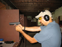
The new header looks amazing. One of the reasons I hadn't gone ahead and done something fancy is that I really didn't know what I wanted - oh, I had a couple ideas and all, but lacked the artistic talent and technical know-how to bring my jumbled thoughts into fruition. Robb patiently extracted the important bits (bayonet! hand cannon!) and brought it together into a stylish, attractive (well, as attractive as anything with my ugly mug on it can be), and eye-catching header.
Those of you who might be interested, Robb's available for contract work...
That is all.


21 comments:
Well, it does capture the essential Jay, now, doesn't it?
Nicely done Robb.
Damn, that shit scared the crap outta me this early in the morning. Nice!
Sweet!
Dear blogfather... that is awesome!!!
Looks nice.
Tho as somebody who shoots with you, I will note that the barrels on those revolvers are about 4" too short!
Hmmmm....i wonder if there is too fine of detail in there to make an embossing stamp of it, and you can start offering MArooned-theme holsters to your groupies....
Now it seems like there's even more connection between you and the guy from
here:
http://basicinstructions.net/
Subtle, Refined, with just a hint Flair, nice work Robb!
Wonder if anyone will notice?
Dragon, I love my VC embossed Holster, but I draw the line at uglying up a quality holster with Jay's banged-up grill! : ]
(Love ya, Jay!)
Hey, it's *my* banged up grill and even *I* wouldn't want to deface one of Dennis's beautiful holsters with it...
THE EYES FOLLOW ME
With a depiction of the ultra-rare LEFTHANDED S&W 629?
Lefty state, left gun?
GIGGLE POLICE!
Keystone has a point. Did you get permission from Scott Meyer to use one of his cartoon characters?
I love it so so much.
Love the new header. Pretty well sums you up! Nice in your face clear and simple.
I love it! It's you!
I have to disagree. I much preferred the old header. The new one is (to my eye) _too_ crazy and in-your-face.
If Robb had helped you with the MHI logo, you would have won. Just sayin'.
Delightfully in-your-face, yet restrained. Well done, Robb!
I was pleasantly surprised by the new graphic when I popped over to Blogger from Google Reader so I could read comments. (I am way behind on my MArooned reading.)
It's a modern classic. Great work, Robb! Great taste as usual, Jay.
Post a Comment